
Animation
News Graphics Package
Timeline: March 2024
A news broadcast would not be the same without the graphics used to tell stories. They can convey information to an audience easily and effectively. I created my own news graphics that could be used in a broadcast using different Adobe Creative Cloud softwares.
Research
Before working on my own news graphics package, I found some examples of videos from real news stations that show off their graphics.
This is an example from the news station I work for, WFSB Channel 3 in Connecticut. The colors are very typical for news graphics, using red, blue, and white. To start, the stinger intro has constant motion and is eye catching for a viewer. The sound effect makes the motion feel real before we even see the anchors. I like how the lower thirds have motion at all times with the lines below. They also collapse on themselves, which is interesting.
This video shows an example of a map used in a newscast in New York. The outline starts in black, then some lines change color. I like the slow overlay of the purple, but the map graphic I create will have more of a zooming effect.
This clip has an example of an animated side panel that reveals text in a row. I really like the way the text comes out of a box then slides in and stays on the screen. This is a unique graphic because I have not seen something with this animation technique before.
Finally, this is one example of a fullscreen graphic used on a show for Quinnipiac’s student run television station (you might recognize the anchor!). The fullscreen moves in before the text opacity rises and it shows up. All the graphics used in this entire newscast are made in Adobe After Effects.
The Process
I created four graphics that could be used in a news broadcast. They include…
Animated stinger
A lower third
A fullscreen with bullets
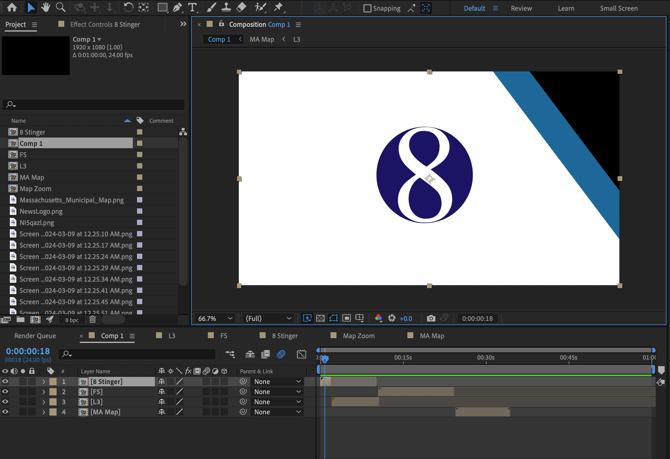
A fullscreen with a map
I started by making my own fake news station logo in Adobe Illustrator. That is used in all the lower thirds and the stinger animation for branding.
Then I created an animated stinger with keyframes. I used three boxes and animated their positions with the keyframes. I also edited the time with the Speed Graph and made the logo increase in size to add more motion. A Youtube tutorial helped with this one.
The lower third, fullscreen, and map were also made with keyframes changing the position, scale, and opacity. I used motion blur to make the movement smoother. I also added sound from freesound.org here to make it more exciting.
Conclusion
As someone who works in news, this was a really fun project to execute. At work every day, I customize graphic templates to convey information during my show. This allowed me to create my own look for graphics that I could also easily customize with text. Overall, I think this short sample of news graphics came out well and showed off some of the many skills I have learned on Adobe After Effects.